Box Model in CSS
Practical Example
Creating a Layout with Box Model
In this practical example, we will apply the concepts learned about the Box Model to create a more complex blog layout, including more text content that will influence the size of the boxes. This approach will help you understand how elements expand and adapt based on their content and Box Model properties.
Designing an Expanded Blog Layout
Our goal is to design a layout for a blog that is not only functional but also visually appealing and adaptive to the content.
Detailed HTML Structure
Here is the updated HTML structure with more content:
Applying CSS Styles
Now, let's delve into the CSS styles to properly handle the content and dimensions of our boxes:
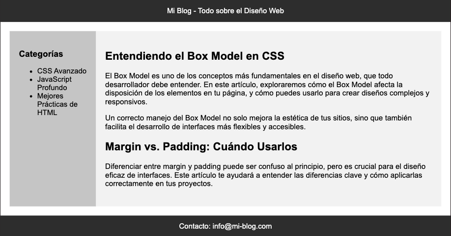
Visualizing the Layout
 Screenshot 2024-04-20 at 8.36.02 PM.png
With this CSS, each section of the blog is styled to effectively manage the content, showing how padding and margin contribute to the overall layout and how box-sizing: border-box helps to keep the box dimensions controlled despite the expansive content.
Conclusion
This practical exercise provides a clear view of how the Box Model facilitates the creation of responsive and adaptable designs. Practicing with different content and style configurations will allow you to master the design of effective and attractive interfaces.
In the next and final section, we will conclude our course on the Box Model in CSS.
Support Chuck’s Academy!
Enjoying this course? I put a lot of effort into making programming education free and accessible. If you found this helpful, consider buying me a coffee to support future lessons. Every contribution helps keep this academy running! ☕🚀

Chat with Chuck


