HTML Forms
Attributes and Controls in HTML Forms
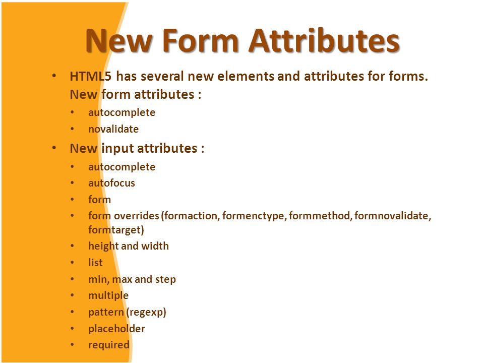
In this chapter, we will focus on the attributes and controls that can be applied to HTML forms. These attributes allow you to customize the behavior of elements, ensuring that the user experience is intuitive and meets the form's requirements. We will review the most commonly used attributes and how they can optimize the functionality and accessibility of forms.

required Attribute: Mandatory Fields
The required attribute ensures that a field is mandatory before allowing the form to be submitted. This is useful for fields that are essential to the form's functionality, such as names or email addresses.
html
placeholder Attribute: Input Field Hints
The placeholder attribute displays a hint text inside a field until the user starts typing. This attribute is useful for indicating the expected format or type of data.
html
Control Attributes: readonly and disabled
The readonly and disabled attributes limit user interactions with input fields.
- readonly: Allows the user to view the field's content but not modify it.
- disabled: Completely deactivates the field, preventing any interaction.
Example of readonly and disabled
html
maxlength and minlength Attributes: Limiting Text Length
The maxlength and minlength attributes set the minimum and maximum length for input field values.
html
Validation with the pattern Attribute
The pattern attribute specifies a regular expression that defines the expected format of an input field's value. It is especially useful for data with specific formats, such as phone numbers or postal codes.
html
Numeric Value Control: min, max, and step
For number type fields, the min, max, and step attributes specify a range and increment for user input values.
html
autocomplete Attribute
The autocomplete attribute enables the browser to suggest previously entered values for specific fields, improving the user's experience with common forms.
html
autofocus Attribute: Automatic Focus
The autofocus attribute automatically focuses a field when the page loads, helping the user to start completing the form right away.
html
novalidate Attribute in Forms
The novalidate attribute is applied to the <form> tag to disable the browser's built-in HTML validation. This can be useful when validation will be performed using JavaScript or another method.
html
Grouping Fields with fieldset and legend
Using fieldset and legend allows grouping related fields and providing a descriptive title for the group, enhancing the form's structure and accessibility.
html
Chapter Conclusion
In this chapter, we explored the different attributes and controls that can be applied to forms and their elements in HTML, learning how each affects the usability and validation of entered data. In the next chapter, we will dive into form validation and constraints, where we will learn how to ensure that the entered data is correct and in the proper format.
Support Chuck’s Academy!
Enjoying this course? I put a lot of effort into making programming education free and accessible. If you found this helpful, consider buying me a coffee to support future lessons. Every contribution helps keep this academy running! ☕🚀

Chat with Chuck

- Introduction to HTML Forms
- HTML Form Elements
- Attributes and Controls in HTML Forms
- Validation and Constraints in HTML Forms
- Advanced HTML Form Elements
- Form Submission and Data Handling
- Styling HTML Forms with CSS
- Best Security Practices in HTML Forms
- Interactive and Dynamic Forms
- Best Practices and Common Errors in HTML Forms
- Conclusion of the HTML Forms Course


