Responsive Design in CSS
Advanced Media Queries for Precise Design Control
Media queries are one of the pillars of responsive design, allowing a website's styles to adapt based on screen size, resolution, and other device factors. In this chapter, we delve into the advanced use of media queries for more precise design control, exploring aspects such as screen orientation, high-density resolutions, and how to implement fluid breakpoints.
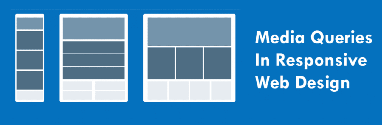 Media Queries in responsive design
Reminder: What are Media Queries?
Media queries allow CSS styles to be applied based on certain device or browser window characteristics. Typically, media queries respond to the viewport dimensions, adjusting the design based on screen width.
css
Media Queries by Screen Orientation
Beyond screen width, you can use media queries to apply styles based on device orientation, meaning whether the screen is in portrait or landscape mode.
css
Combined Use of Width and Orientation
It is possible to combine media queries to apply more specific styles that consider both screen size and its orientation.
css
Media Queries for Pixel Density (Retina Resolutions)
For devices with high pixel density screens, such as iPhones and other Retina display phones, specific media queries can be used to adapt images and other graphical elements for a crisp appearance.
css
Alternatively, you can use -webkit-min-device-pixel-ratio for WebKit browsers:
css
Media Queries by Aspect Ratio
The aspect ratio of a screen or window is another criterion you can use in media queries. This is especially useful for adjusting the design on screens with non-standard proportions, like some mobile devices or televisions.
css
You can also use max-aspect-ratio or min-aspect-ratio to handle minimum or maximum aspect ratios.
css
Media Queries for Color Scheme
With the rise in popularity of the dark mode, media queries can detect the user's preference for a light or dark color scheme, allowing you to adjust styles accordingly.
css
Similarly, you can apply specific styles for the light mode:
css
Fluid Breakpoints with clamp()
Instead of using fixed media queries, the clamp() function allows for fluid breakpoints, which adjust CSS properties progressively between a range of values. This is useful for scaling elements like fonts and margins.
css
In this example, the font size adjusts between 1.5rem and 3rem, with a dynamic size based on 5vw (5% of the viewport width).
Complete Example of Advanced Media Queries
Below is an example that combines several advanced media query techniques for more precise design control:
html
Conclusion
Advanced media queries allow for much more precise control over design on different devices and viewing conditions. From screen orientation to dark mode preferences, these tools enhance the flexibility and adaptability of web design.
Support Chuck’s Academy!
Enjoying this course? I put a lot of effort into making programming education free and accessible. If you found this helpful, consider buying me a coffee to support future lessons. Every contribution helps keep this academy running! ☕🚀

Chat with Chuck


- Introduction to Responsive Design
- Responsive Units and Media Queries
- Advanced Media Queries for Precise Design Control
- Mobile-First Design
- CSS Grid: Responsive Grid Design
- Flexbox and Its Application in Responsive Design
- Scalable and Flexible Typography
- Responsive Images and Media
- Sass and Responsive Design
- Using CSS Variables for Responsive Design
- Tailwind CSS: A Utility Framework for Responsive Design
- Bootstrap: Responsive Design with Prebuilt Components
- Accessibility in Responsive Design
- Dark Mode and Responsive Themes in Web Design
- Optimization and Performance in Responsive Design
- Testing and Tools for Responsive Design
- Good Practices and Responsive Design Patterns
- Conclusions and Next Steps in Responsive Design