Responsive Design in CSS
Responsive Units and Media Queries
In this chapter, we will explore two key tools that enable the creation of adaptable and flexible websites: responsive units and media queries. These techniques are fundamental for making your design fluid and suitable for different screen sizes.
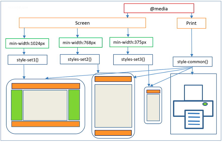 Here the design is shown adapting to different screen sizes
Responsive Units
Measurement units in CSS play a crucial role in responsive design. While absolute units like px (pixels) are fixed and do not adjust to the screen size, responsive units allow for more flexible designs.
Relative Units
Relative units adjust based on other elements on the page or the screen size. The most common ones are:
em: This unit is based on the font size of the parent element. If the parent font size is 16px,1emwill equal 16px. If the parent's font size changes, theemvalue will also change.rem: Similar toem, but it is based on the root document's font size (thehtml). This means that1remwill be equivalent to the font size of thehtmlelement, which is typically 16px unless changed.vwandvh: These units are based on the width and height of the viewport, respectively.1vwis 1% of the screen's width, and1vhis 1% of the height.
Let's see an example of how to use these units:
css
Media Queries
Media queries are the foundation of responsive design as they allow different styles to be applied based on the characteristics of the device or viewport, such as the width, height, orientation, and even the screen resolution.
Structure of a Media Query
The basic structure of a media query is:
css
The condition can be, for example, the screen width:
css
Using Media Queries for Different Devices
A common practice in responsive design is defining several breakpoints to adjust the design depending on the device. Below is an example of how we can use different media queries for different screen sizes:
css
Example of Responsive Units and Media Queries in Action
Let's combine what we've learned so far into a practical example:
html
Conclusion
Proper use of responsive units and media queries is crucial for creating adaptable and accessible websites. These tools allow you to design interfaces that adjust perfectly to any device.
Support Chuck’s Academy!
Enjoying this course? I put a lot of effort into making programming education free and accessible. If you found this helpful, consider buying me a coffee to support future lessons. Every contribution helps keep this academy running! ☕🚀

Chat with Chuck


- Introduction to Responsive Design
- Responsive Units and Media Queries
- Advanced Media Queries for Precise Design Control
- Mobile-First Design
- CSS Grid: Responsive Grid Design
- Flexbox and Its Application in Responsive Design
- Scalable and Flexible Typography
- Responsive Images and Media
- Sass and Responsive Design
- Using CSS Variables for Responsive Design
- Tailwind CSS: A Utility Framework for Responsive Design
- Bootstrap: Responsive Design with Prebuilt Components
- Accessibility in Responsive Design
- Dark Mode and Responsive Themes in Web Design
- Optimization and Performance in Responsive Design
- Testing and Tools for Responsive Design
- Good Practices and Responsive Design Patterns
- Conclusions and Next Steps in Responsive Design