Responsive Design in CSS
Dark Mode and Responsive Themes in Web Design
Dark mode has gained popularity in recent years due to its impact on user experience, reducing eye strain, and saving battery life on mobile devices with OLED screens. In this chapter, we will explore how to implement dark mode and other responsive themes using CSS, media queries, and CSS variables.
What is Dark Mode?
Dark mode is a design option where the interface background colors are dark, while the text and interactive elements are light. Many users prefer dark mode to reduce eye strain, especially in low-light environments.
A website's design should be flexible enough to adapt to user preferences. Through media queries and CSS variables, you can dynamically implement dark mode and other themes, offering a personalized experience.
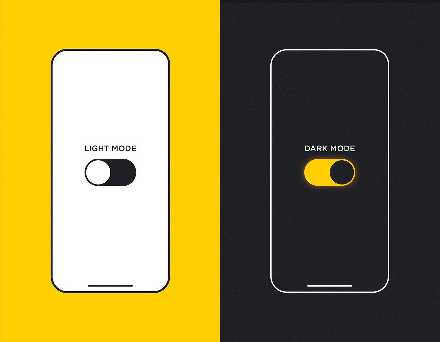 This image shows a comparison between dark theme vs light theme
Basic Implementation of Dark Mode with Media Queries
The prefers-color-scheme media query allows detecting if the user has configured their device to use a dark or light color scheme. According to this preference, we can automatically adjust the website styles.
css
In this example, the background color and text color change depending on whether the device is set to dark or light mode. CSS variables make managing these themes easier.
Manually Toggling Between Light and Dark Mode
In addition to detecting system preferences, it's common to allow users to manually toggle between dark and light mode. This can be achieved using JavaScript to change the values of CSS variables.
html
In this example, a button allows toggling between light and dark mode by adding or removing the dark-mode class from the body element. Transitions are applied to make the theme change smoother.
Responsive Themes with CSS Variables
CSS variables are extremely useful for implementing other types of responsive themes, such as themes based on specific brand colors or seasonal styles (e.g., a winter theme). You can define different color schemes and allow users to toggle between them.
css
Dark Mode and Energy Saving
Dark mode not only enhances user experience but can also help save energy on devices with OLED screens. On these types of screens, dark pixels consume less energy than bright pixels. By implementing dark mode, you can enhance your website's energy efficiency on these devices.
Full Example of Dark Mode and Responsive Themes
Below is a complete example of how to combine dark mode and responsive themes using media queries, CSS variables, and JavaScript:
html
Conclusion
Dark mode and responsive themes are powerful tools to improve user experience and make websites more dynamic and personalized. By using media queries and CSS variables, you can offer greater design flexibility and adapt it according to user preferences or device conditions.
Support Chuck’s Academy!
Enjoying this course? I put a lot of effort into making programming education free and accessible. If you found this helpful, consider buying me a coffee to support future lessons. Every contribution helps keep this academy running! ☕🚀

Chat with Chuck


- Introduction to Responsive Design
- Responsive Units and Media Queries
- Advanced Media Queries for Precise Design Control
- Mobile-First Design
- CSS Grid: Responsive Grid Design
- Flexbox and Its Application in Responsive Design
- Scalable and Flexible Typography
- Responsive Images and Media
- Sass and Responsive Design
- Using CSS Variables for Responsive Design
- Tailwind CSS: A Utility Framework for Responsive Design
- Bootstrap: Responsive Design with Prebuilt Components
- Accessibility in Responsive Design
- Dark Mode and Responsive Themes in Web Design
- Optimization and Performance in Responsive Design
- Testing and Tools for Responsive Design
- Good Practices and Responsive Design Patterns
- Conclusions and Next Steps in Responsive Design