Responsive Design in CSS
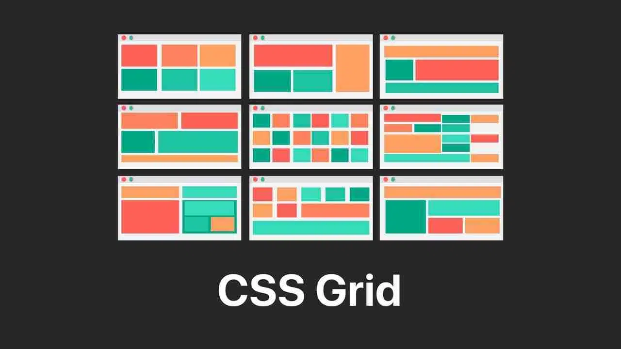
CSS Grid: Responsive Grid Design
CSS Grid is one of the most powerful layout systems available in CSS. It facilitates the creation of complex and responsive designs using a grid-based approach. Unlike Flexbox, which focuses on single-axis design (horizontal or vertical), CSS Grid allows you to work in two dimensions, making it an ideal tool for designing full-page structures.
What is CSS Grid?
CSS Grid is a design system that organizes elements into a grid defined by rows and columns. Through this system, you can place elements in specific positions or allow them to automatically distribute within the grid.
 CSS Grid
CSS Grid Fundamentals
Designing with CSS Grid starts by defining a container as a grid using the display: grid property. Within this container, the child elements are organized in rows and columns.
css
Defining Columns and Rows
You can customize the size of your grid's columns and rows with grid-template-columns and grid-template-rows. Fractions (fr) are a popular unit in CSS Grid because they divide the available space proportionally among the columns.
css
Placing Elements in the Grid
One of the advantages of CSS Grid is the ability to place elements exactly where you need them, in both rows and columns. To do this, grid-column and grid-row properties are used.
css
Creating a Responsive Layout with CSS Grid
CSS Grid makes it easy to create designs that adapt to different screen sizes. This is achieved by combining the use of media queries with flexible units like fr and auto. Let's look at an example of how a three-column layout can adapt for small screens:
css
Using Grid Areas
CSS Grid allows defining "grid areas" to semantically assign whole sections of the grid to different elements. This can greatly simplify code and make it easier to read.
css
Complete Layout Example with CSS Grid
Below is a complete example of a layout using CSS Grid that adapts responsively to different screen sizes:
html
Conclusion
CSS Grid is an extremely powerful tool for creating complex and responsive layouts. By understanding how to organize elements into rows and columns, and how to make these layouts adapt to different screen sizes, you can create modern and flexible user interfaces.
Support Chuck’s Academy!
Enjoying this course? I put a lot of effort into making programming education free and accessible. If you found this helpful, consider buying me a coffee to support future lessons. Every contribution helps keep this academy running! ☕🚀

Chat with Chuck


- Introduction to Responsive Design
- Responsive Units and Media Queries
- Advanced Media Queries for Precise Design Control
- Mobile-First Design
- CSS Grid: Responsive Grid Design
- Flexbox and Its Application in Responsive Design
- Scalable and Flexible Typography
- Responsive Images and Media
- Sass and Responsive Design
- Using CSS Variables for Responsive Design
- Tailwind CSS: A Utility Framework for Responsive Design
- Bootstrap: Responsive Design with Prebuilt Components
- Accessibility in Responsive Design
- Dark Mode and Responsive Themes in Web Design
- Optimization and Performance in Responsive Design
- Testing and Tools for Responsive Design
- Good Practices and Responsive Design Patterns
- Conclusions and Next Steps in Responsive Design