Responsive Design in CSS
Using CSS Variables for Responsive Design
CSS variables, also known as Custom Properties, are a powerful tool that allows you to define reusable values within your stylesheet. Instead of repeating values like colors, sizes, and spacings throughout the code, you can define them once as variables and reuse them, which improves both maintainability and flexibility of the design.
CSS variables are especially useful in responsive design because they allow styles to easily adapt to different resolutions and devices without the need for manual adjustments at each breakpoint.
What are CSS Variables?
CSS variables allow you to store values for reuse in multiple parts of the stylesheet. These variables are defined with two dashes (--) at the start of the name and can be declared globally (in the :root selector) or within a specific selector.
css
Once declared, you can use the variables anywhere in the CSS file using the var() function.
css
Benefits of Using CSS Variables in Responsive Design
Style Centralization
By using CSS variables, you can centralize your styles and ensure that any change to a variable is automatically reflected throughout the design. This is particularly useful when you need to adjust colors or sizes for different devices or breakpoints.
Dynamic Adjustments
With CSS variables, you can dynamically adjust values on different screen sizes using media queries.
css
Ease for Dark and Light Themes
Another key advantage of CSS variables is that you can use them to easily switch between light and dark themes. Simply change the variable values based on the selected theme mode.
css
Complete Example of Using CSS Variables in Responsive Design
Below is a complete example of how to use CSS variables to enhance the flexibility of a responsive design:
html
Best Practices with CSS Variables
- Use Global Variables for Common Styles: Define the most important variables, such as colors and font sizes, in the
:rootselector so they are available throughout the document. - Organize Variables by Themes: If you are using variables to implement light and dark themes, organize each theme's variables in clear sections within your CSS file.
- Leverage Variable Inheritance: CSS variables inherit their values through the DOM, allowing you to set variables in specific components and override them when necessary.
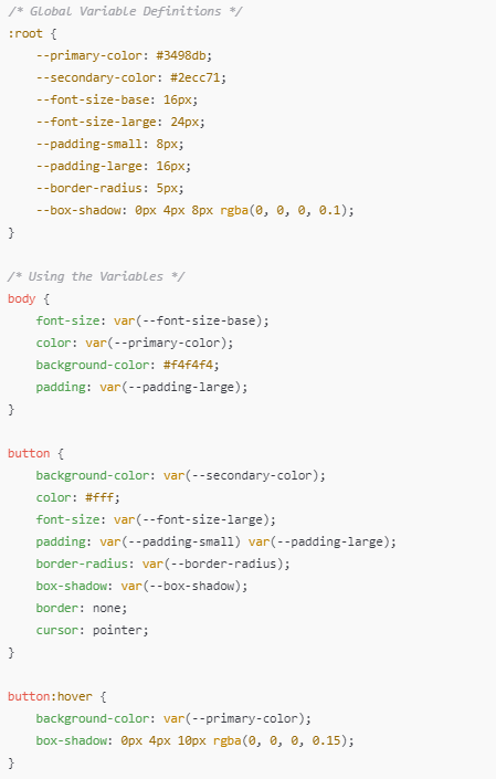 This image shows an organized code structure with CSS variables defined globally
Conclusion
Using CSS variables is an excellent way to improve the flexibility, maintainability, and scalability of your responsive design projects. They enable you to centralize key values, dynamically adjust styles according to breakpoints, and simplify the management of dark and light themes.
Support Chuck’s Academy!
Enjoying this course? I put a lot of effort into making programming education free and accessible. If you found this helpful, consider buying me a coffee to support future lessons. Every contribution helps keep this academy running! ☕🚀

Chat with Chuck


- Introduction to Responsive Design
- Responsive Units and Media Queries
- Advanced Media Queries for Precise Design Control
- Mobile-First Design
- CSS Grid: Responsive Grid Design
- Flexbox and Its Application in Responsive Design
- Scalable and Flexible Typography
- Responsive Images and Media
- Sass and Responsive Design
- Using CSS Variables for Responsive Design
- Tailwind CSS: A Utility Framework for Responsive Design
- Bootstrap: Responsive Design with Prebuilt Components
- Accessibility in Responsive Design
- Dark Mode and Responsive Themes in Web Design
- Optimization and Performance in Responsive Design
- Testing and Tools for Responsive Design
- Good Practices and Responsive Design Patterns
- Conclusions and Next Steps in Responsive Design