Responsive Design in CSS
Good Practices and Responsive Design Patterns
Responsive design is not only about adjusting content to different screen sizes but also about following best practices to ensure that sites are efficient, accessible, and easy to maintain. In this chapter, we will explore the best practices and common patterns that will help you create high-quality responsive designs.
Good Practices in Responsive Design
Start with Mobile-First
The mobile-first approach involves starting to design and develop with mobile devices in mind and then adding enhancements for larger screens. This approach ensures that the mobile version of the site is lightweight and fast, as it is the foundation of the design.
css
Use Relative Units
Relative units such as em, rem, vw, and vh allow elements to scale properly on different devices. Avoid using fixed units like px to ensure that content adjusts proportionally.
css
Define Smart Breakpoints
Breakpoints are essential for adjusting the design based on screen size. However, it's not necessary to set breakpoints for every possible screen size. Use logical breakpoints that fit the needs of the content.
css
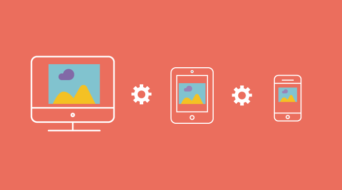 This image shows how smart breakpoints are used to adjust the design for different screen sizes.
Optimize Performance
Performance is an essential part of responsive design. Make sure to optimize images, minimize CSS and JavaScript, and leverage caching to improve load times.
html
Maintain Accessibility
Responsive design must also be accessible to all users. Ensure that interactive elements are easy to use on touch screens and that color contrast is sufficient for good readability.
css
Common Patterns in Responsive Design
Flexible Grids
The flexible grid pattern is one of the most common in responsive design. Using display: grid or display: flex, you can create layouts that automatically adapt to different screen sizes.
css
Collapsible Navigation Menus
On mobile devices, navigation menus often take up too much space. A common pattern is to use collapsible menus that only expand when the user needs them.
html
Priority Content
In mobile-first design, it is important to show the most relevant content to the user first. Secondary content can be relegated to larger screens.
html
Adaptive Images
Use srcset and sizes to serve images of different resolutions based on screen size, ensuring an optimal experience on all devices.
html
Complete Example of Good Practices in Responsive Design
Below is a complete example that implements the discussed best practices:
html
Conclusion
Responsive design involves more than just adjusting content to screen size. Following best practices and common patterns will allow you to create more efficient, accessible, and easier to maintain sites. By implementing these strategies, you will be able to provide an optimal user experience on any device. With this, we have covered the key elements of responsive design. Keep creating modern and adaptable websites!
Support Chuck’s Academy!
Enjoying this course? I put a lot of effort into making programming education free and accessible. If you found this helpful, consider buying me a coffee to support future lessons. Every contribution helps keep this academy running! ☕🚀

Chat with Chuck


- Introduction to Responsive Design
- Responsive Units and Media Queries
- Advanced Media Queries for Precise Design Control
- Mobile-First Design
- CSS Grid: Responsive Grid Design
- Flexbox and Its Application in Responsive Design
- Scalable and Flexible Typography
- Responsive Images and Media
- Sass and Responsive Design
- Using CSS Variables for Responsive Design
- Tailwind CSS: A Utility Framework for Responsive Design
- Bootstrap: Responsive Design with Prebuilt Components
- Accessibility in Responsive Design
- Dark Mode and Responsive Themes in Web Design
- Optimization and Performance in Responsive Design
- Testing and Tools for Responsive Design
- Good Practices and Responsive Design Patterns
- Conclusions and Next Steps in Responsive Design