Responsive Design in CSS
Flexbox and Its Application in Responsive Design
Flexbox, or flexible box model, is a one-dimensional layout system that facilitates the distribution of elements within a container. Unlike CSS Grid, which organizes elements in two dimensions (rows and columns), Flexbox operates along a single axis, either horizontal or vertical. Flexbox is particularly useful for aligning and distributing space between elements, and is widely used to create responsive and adaptable designs.
What is Flexbox?
Flexbox is a method for efficiently distributing elements within a container. The parent container behaves as a "flex container" and its children as "flex items." With Flexbox, you can easily control the order, alignment, and size of child elements.
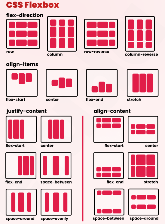 Visual reference of Flexbox
Basic Structure of Flexbox
To use Flexbox, you need to declare display: flex on the parent container. The elements inside the container will align in a row by default.
css
Main Properties of Flexbox
Flexbox offers several properties that allow you to customize the alignment and distribution of elements. Below, we review some of the most important properties.
flex-direction
This property defines the main axis on which the elements will be aligned. By default, the elements align in a horizontal row (row), but they can also be aligned in a column (column).
css
justify-content
Controls how elements are distributed along the main axis. You can center the elements, distribute them evenly, or align them towards the start or end of the container.
css
align-items
This property controls the alignment of elements along the cross axis (perpendicular to the main axis). You can align the elements to the start, center, or end of the container.
css
Flexbox Layout Example
Let's look at a simple example of Flexbox applied to a responsive design:
css
This code distributes three items evenly in a row, with space around each one. Additionally, each item has the ability to expand or shrink according to the available space thanks to the flex property.
Responsive Design with Flexbox
Flexbox is especially useful in responsive design because it allows elements to easily adapt to the size of the container. Combined with media queries, Flexbox can create layouts that dynamically adjust to different screen sizes.
css
Flexbox vs CSS Grid
While both Flexbox and CSS Grid are powerful tools for creating layouts, each has its advantages and specific use cases. Flexbox is ideal for aligning elements in one dimension (horizontal or vertical) and for dynamically adjusting spaces between elements. On the other hand, CSS Grid is more suitable for creating complex layouts in two dimensions.
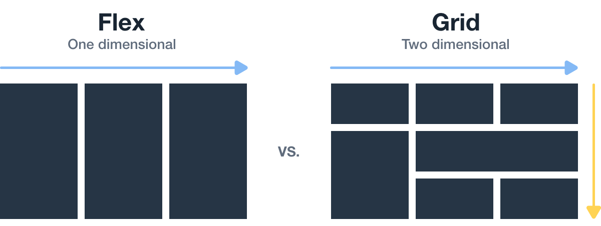 This image shows the comparison between flexbox and css grid
Complete Example of Flexbox in Action
Below is a complete example using Flexbox for a design that adapts to different screen sizes:
html
Conclusion
Flexbox is a powerful and flexible tool for creating responsive layouts, especially when it comes to the alignment and distribution of elements along a single axis.
Support Chuck’s Academy!
Enjoying this course? I put a lot of effort into making programming education free and accessible. If you found this helpful, consider buying me a coffee to support future lessons. Every contribution helps keep this academy running! ☕🚀

Chat with Chuck


- Introduction to Responsive Design
- Responsive Units and Media Queries
- Advanced Media Queries for Precise Design Control
- Mobile-First Design
- CSS Grid: Responsive Grid Design
- Flexbox and Its Application in Responsive Design
- Scalable and Flexible Typography
- Responsive Images and Media
- Sass and Responsive Design
- Using CSS Variables for Responsive Design
- Tailwind CSS: A Utility Framework for Responsive Design
- Bootstrap: Responsive Design with Prebuilt Components
- Accessibility in Responsive Design
- Dark Mode and Responsive Themes in Web Design
- Optimization and Performance in Responsive Design
- Testing and Tools for Responsive Design
- Good Practices and Responsive Design Patterns
- Conclusions and Next Steps in Responsive Design