Responsive Design in CSS
Mobile-First Design
The Mobile-First approach is a design and development methodology that prioritizes the user experience on mobile devices. Since most users access the internet from mobile devices, this approach ensures that applications and websites are functional and aesthetically pleasing on small screens before scaling to larger devices, such as tablets and desktops.
What is Mobile-First?
The Mobile-First approach involves starting the design and development with small screens in mind. This means that the main content and functionality must be optimized for mobile, and then additional styles and features are added for larger screens using media queries and other design techniques.
This approach not only improves the user experience but also promotes cleaner and more efficient code, as unnecessary dependencies that could affect performance on mobile devices are removed.
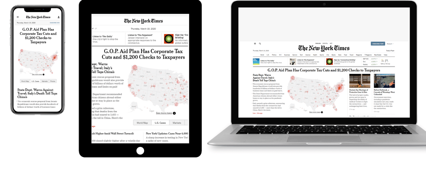 This image shows how a website adapts to different screen sizes in a Mobile-First approach.
Advantages of the Mobile-First Approach
The Mobile-First design offers a series of advantages that make it a recommended practice in modern development:
Usability Priority
Mobile users expect a fast and simple experience. With Mobile-First, essential functions are prioritized, simplifying the design and avoiding resource overload.
Performance Optimization
Since the design is initially intended for mobile devices, websites are lighter and faster, reducing load time on mobile networks, which tend to be slower.
Improvement in Adaptability
By creating first for mobile, it ensures that content progressively adapts to larger screens, rather than trying to scale down a large design for small screens.
Implementing the Mobile-First Approach
Let's look at an example of how to implement a Mobile-First design in CSS. We start by defining styles for mobile and then add media queries for larger screens.
css
Content Prioritization
In the Mobile-First approach, it's crucial to prioritize content. This involves thinking about which elements are essential for the mobile user and structuring them so they are presented clearly and quickly. Non-essential or secondary elements may be hidden in the mobile version and shown only on larger screens.
Tools for Mobile-First Development
There are several tools that facilitate Mobile-First development, such as:
- Viewport Meta Tag: Helps control how the site scales on mobile devices. It's important to include it in the head of your HTML document:
html
- Media Queries: Are essential for scaling from a mobile design to one for larger screens, as shown in the previous examples.
Best Practices in Mobile-First
When adopting the Mobile-First approach, it's important to follow some best practices to ensure your design is effective and accessible:
- Minimize resources: Mobile users often have slower data connections, so it's essential to reduce resource use such as large images and unnecessary scripts.
- Simplify navigation: Less is more when it comes to mobile navigation. Use simple and accessible menus.
- Optimize typography: Ensure the text is readable on small screens by adjusting font sizes and line spacing.
Complete Mobile-First Example
Below is a complete example of a Mobile-First approach in HTML and CSS:
html
Conclusion
The Mobile-First approach ensures that websites are accessible, fast, and easy to use on mobile devices, while the design scales progressively for larger screens.
Support Chuck’s Academy!
Enjoying this course? I put a lot of effort into making programming education free and accessible. If you found this helpful, consider buying me a coffee to support future lessons. Every contribution helps keep this academy running! ☕🚀

Chat with Chuck


- Introduction to Responsive Design
- Responsive Units and Media Queries
- Advanced Media Queries for Precise Design Control
- Mobile-First Design
- CSS Grid: Responsive Grid Design
- Flexbox and Its Application in Responsive Design
- Scalable and Flexible Typography
- Responsive Images and Media
- Sass and Responsive Design
- Using CSS Variables for Responsive Design
- Tailwind CSS: A Utility Framework for Responsive Design
- Bootstrap: Responsive Design with Prebuilt Components
- Accessibility in Responsive Design
- Dark Mode and Responsive Themes in Web Design
- Optimization and Performance in Responsive Design
- Testing and Tools for Responsive Design
- Good Practices and Responsive Design Patterns
- Conclusions and Next Steps in Responsive Design