Responsive Design in CSS
Introduction to Responsive Design
Responsive design is a fundamental technique in modern web development that enables applications and websites to adapt to a variety of devices and screen sizes. With the increase in the use of mobile devices, such as smartphones and tablets, it is essential for user interfaces to look and function correctly on small, medium, and large screens.
What is Responsive Design?
Responsive design refers to a website's ability to automatically adjust to the screen size of the device it's being viewed on. Through the use of techniques like media queries, relative units, and content adaptation, sites can provide an optimal user experience regardless of whether they are accessed from a mobile, tablet, or desktop computer.
Mobile-First: A Prioritized Approach
The mobile-first approach has become increasingly popular, as it prioritizes creating sites that function first on mobile screens and then scale up to larger screens. This approach involves developing the basic structure and content for mobiles and then, through the use of media queries, adding additional styles for larger screens.
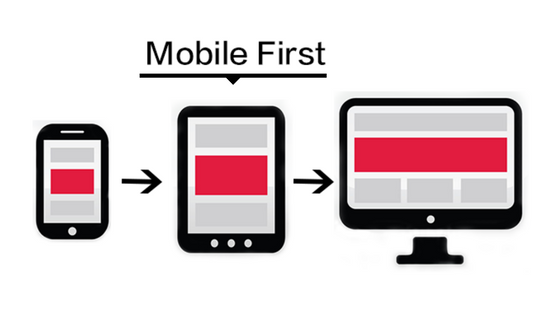 a mobile-first design adapts to different screen sizes
Advantages of Responsive Design
One of the main advantages of responsive design is that it eliminates the need to create multiple versions of a website for different devices. By implementing a single design that adjusts automatically, development and maintenance are simplified, and the user experience is improved.
Flexibility
Responsive design allows website elements, such as images, text, and buttons, to be flexibly reorganized based on screen size. This flexibility not only enhances the site's appearance but also contributes to more intuitive navigation on mobile devices.
SEO Improvement
Google and other search engines value sites that offer a consistent and optimized user experience for mobiles, so responsive design can help improve a website's SEO (Search Engine Optimization).
Example of Responsive HTML/CSS Structure
Let's look at a simple example of a responsive HTML and CSS structure:
html
Progressive Enhancement
Instead of creating a completely different design for each device, responsive design uses progressive enhancement. This means the site starts with a simple and functional base that expands and improves as the device allows more space and power.
Tools for Responsive Testing
There are multiple tools available to check how a site will look on different devices and resolutions. Modern browsers like Google Chrome and Firefox offer developer tools that allow for emulating different screen sizes.
Conclusion
Responsive design is an essential component for any modern website. By learning to properly implement this technique, you can ensure that your projects are accessible and functional on any device.
Support Chuck’s Academy!
Enjoying this course? I put a lot of effort into making programming education free and accessible. If you found this helpful, consider buying me a coffee to support future lessons. Every contribution helps keep this academy running! ☕🚀

Chat with Chuck


- Introduction to Responsive Design
- Responsive Units and Media Queries
- Advanced Media Queries for Precise Design Control
- Mobile-First Design
- CSS Grid: Responsive Grid Design
- Flexbox and Its Application in Responsive Design
- Scalable and Flexible Typography
- Responsive Images and Media
- Sass and Responsive Design
- Using CSS Variables for Responsive Design
- Tailwind CSS: A Utility Framework for Responsive Design
- Bootstrap: Responsive Design with Prebuilt Components
- Accessibility in Responsive Design
- Dark Mode and Responsive Themes in Web Design
- Optimization and Performance in Responsive Design
- Testing and Tools for Responsive Design
- Good Practices and Responsive Design Patterns
- Conclusions and Next Steps in Responsive Design