Basic CSS
Ensuring Accessibility with CSS
Web accessibility is fundamental to ensuring that all people, including those with disabilities, can access and navigate a website. CSS can play an important role in accessibility when used correctly. In this chapter, you'll learn how to apply CSS to enhance accessibility and create inclusive sites.
What is web accessibility?
Web accessibility involves designing websites and web applications that are usable by people with diverse abilities, including those with visual, auditory, motor, or cognitive disabilities. The goal is to ensure that all users can interact with your website equitably.
Best practices for improving accessibility with CSS
1. Proper color contrast
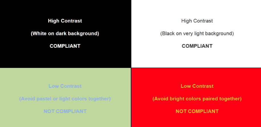
It's important to ensure that the contrast between text and background is sufficient to be legible for people with visual disabilities. The W3C recommends a minimum contrast ratio of 4.5:1 for normal text and 3:1 for large text.
Tools to check color contrast
- Contrast Ratio: contrast-ratio.com allows you to check the contrast ratio between two colors.
- WebAIM Contrast Checker: Another tool to help you verify if colors meet accessibility standards.
css
 this image shows different types of contrasts and their display
2. Avoid excessive use of display: none
Using display: none can hide content from screen readers, which can be problematic for users who rely on them. If you need to visually hide elements without removing them from the document flow for screen readers, use the technique of visually hiding but keeping accessible.
Example of visually hiding but keeping accessible
css
3. Legible font size
Using an appropriate font size is essential for legibility. A base font size of 16px is a good reference for general text. Also, ensure users can adjust the font size according to their needs.
css
4. Use of relative units
Using relative units like em or rem instead of fixed units like px allows users to adjust the text size according to their preferences.
Example of using rem
css
5. Avoid exclusive use of color to convey information
People with visual disabilities, such as color blindness, may not distinguish certain color combinations. Avoid relying solely on color to convey important information. Instead, use text, icons, or underlining along with color.
html
6. Responsive design and accessibility
Ensure the website is responsive, so users with devices of different sizes can access and navigate your site easily. A responsive design also improves accessibility for users with motor disabilities who rely on devices with larger or smaller screens.
Example of media queries
css
7. Focus control
Focus is crucial for the accessibility of users navigating via the keyboard. It's important to ensure that the focus state is visible. Avoid removing the outline style without providing a clear alternative.
Example of focus control
css
Tools to evaluate accessibility
There are several tools you can use to evaluate and improve the accessibility of your website.
- axe Accessibility Checker: A browser extension that analyzes accessibility issues directly on your website.
- WAVE: Another popular tool to check and evaluate website accessibility.
Conclusion
In this chapter, you have learned how to use CSS to improve the accessibility of a website, from ensuring adequate contrast and using legible font sizes to making sure content is accessible to all users regardless of their abilities. By applying these best practices, you'll be creating more inclusive and accessible websites for everyone. In the next chapter, we will discuss how to use animations and transitions with CSS in an accessible and non-intrusive manner.
Support Chuck’s Academy!
Enjoying this course? I put a lot of effort into making programming education free and accessible. If you found this helpful, consider buying me a coffee to support future lessons. Every contribution helps keep this academy running! ☕🚀

Chat with Chuck

- Introduction to CSS
- CSS Selectors
- The Box Model in CSS
- Colors and Backgrounds in CSS
- Typography in CSS
- Design Techniques with CSS
- Responsive Design Fundamentals in CSS
- Responsive Navigation in CSS
- Responsive Forms in CSS
- Combinando CSS con HTML para un diseño completo
- CSS Debugging and Optimization
- Working with CSS Libraries and Frameworks
- Customizing CSS Frameworks
- Structuring Large CSS Projects
- Best Practices for CSS Performance
- Keeping CSS Code Clean and Well-Documented
- Testing and Debugging CSS
- Ensuring Accessibility with CSS
- Use animations and transitions in an accessible manner
- CSS Optimization for Large Websites
- Keeping Clean and Scalable CSS Code


