Basic CSS
The Box Model in CSS
The box model is one of the fundamental concepts in CSS. Every element on a web page is a rectangular box, and the box model describes how the dimensions and spacing around those elements are calculated.
Understanding the box model will allow you to better control the layout and spacing of elements on a page. In this chapter, we'll explore the different components of the box model and how they influence the presentation of elements.
What is the box model?
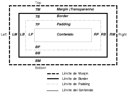
Every element in CSS is represented as a box. This box has different parts that influence the size and location of the element on the page:
- Content: The area where the content resides, such as text or images.
- Padding: The space between the content and the border of the box.
- Border: The border that surrounds the padding (optional).
- Margin: The outer space of the box, which separates the element from other elements.
 the image shows CSS box model displaying content, padding, border, and margin areas
Box model properties
The box model uses several properties to adjust dimensions and spacing. Let's see how they work:
width and height properties
These properties define the size of an element's content area. The size you define with width and height does not include padding, border, or margin.
css
padding property
The padding property adds space between an element's content and its border. You can define padding for each side individually or use the shorthand form.
css
If you want to be more specific and set a different value for each side, you can use the padding-top, padding-right, padding-bottom, and padding-left properties.
css
border property
The border property defines a border around the element. Like with padding, you can define a border for each side individually or use a shorthand property.
css
margin property
The margin property adds space outside the box's border. It is useful for separating elements from one another. Like with padding, you can use specific properties for each side (margin-top, margin-right, etc.) or a shorthand property.
css
Margin collapse
An important concept in CSS is margin collapse. When two elements have consecutive margins, instead of adding the margins, CSS uses only the larger margin. This mainly applies to vertical margins (top and bottom).
css
box-sizing: Controlling box size
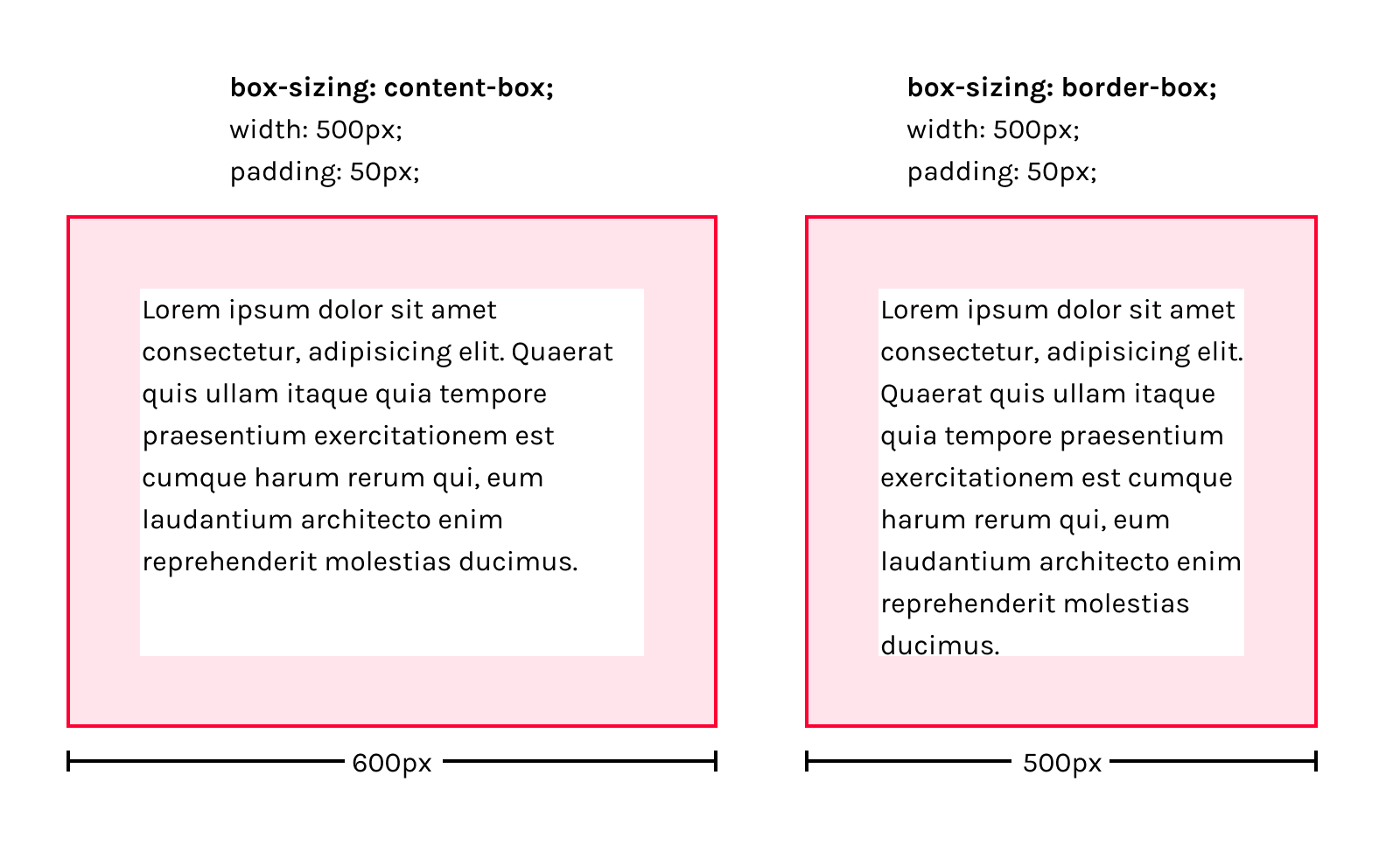
By default, when you define width and height in CSS, these properties only apply to the content area of the element, meaning padding and border are added to the total box size. This can complicate dimension calculations. To solve this issue, we can use the box-sizing property.
box-sizing: content-box (default)
When box-sizing is set to content-box, the width and height only affect the content. Any additional padding or border value increases the total size of the element.
css
box-sizing: border-box
When border-box is used, the width and height include padding and the border. This makes it easier to calculate the dimensions of an element.
css
 Visual comparison between box-sizing: content-box and box-sizing: border-box
Conclusion
In this chapter, we have explored the box model in CSS, a key concept for controlling the spacing and layout of elements on a web page. By understanding how padding, margin, border properties work, and how the box-sizing value affects size calculation, you can have more precise control over your designs. In the next chapter, we'll delve into colors and backgrounds in CSS, so you can add more style and visual appeal to your elements.
Support Chuck’s Academy!
Enjoying this course? I put a lot of effort into making programming education free and accessible. If you found this helpful, consider buying me a coffee to support future lessons. Every contribution helps keep this academy running! ☕🚀

Chat with Chuck

- Introduction to CSS
- CSS Selectors
- The Box Model in CSS
- Colors and Backgrounds in CSS
- Typography in CSS
- Design Techniques with CSS
- Responsive Design Fundamentals in CSS
- Responsive Navigation in CSS
- Responsive Forms in CSS
- Combinando CSS con HTML para un diseño completo
- CSS Debugging and Optimization
- Working with CSS Libraries and Frameworks
- Customizing CSS Frameworks
- Structuring Large CSS Projects
- Best Practices for CSS Performance
- Keeping CSS Code Clean and Well-Documented
- Testing and Debugging CSS
- Ensuring Accessibility with CSS
- Use animations and transitions in an accessible manner
- CSS Optimization for Large Websites
- Keeping Clean and Scalable CSS Code


