Basic CSS
Design Techniques with CSS
An essential part of web design is knowing how to organize elements on a page. CSS provides several ways to control the layout of elements, allowing you to adapt your design to different screens and devices. In this chapter, we will explore the most important design techniques, such as the use of display, position, and float.
The display property
The display property controls how elements are displayed on the page. This property has several important values that determine how elements interact with each other.
display: block
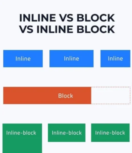
Block elements take up the entire available width of their container and start on a new line. Some examples of default block elements are <div>, <p>, and <h1>.
css
display: inline
Inline elements do not start a new line and only occupy the necessary space. Common examples of inline elements are <span> and <a>.
css
display: inline-block
This value combines aspects of block and inline elements. inline-block elements do not start a new line, but you can define their width and height.
css
display: none
When an element has display: none, it does not appear on the page or occupy any space.
css
 Visual examples showing the difference between display: block, inline, inline-block
The position property
The position property is used to define how an element is positioned on the page. The most common values are static, relative, absolute, and fixed.
position: static
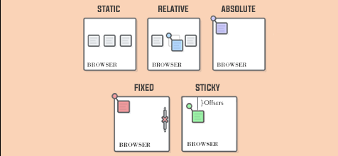
This is the default value. Elements with position: static follow the normal flow of the document and are not affected by the top, right, bottom, or left properties.
css
position: relative
With position: relative, you can move an element in relation to its original position. The top, right, bottom, and left properties control how much the element is displaced from its original location.
css
position: absolute
Elements with position: absolute are removed from the normal document flow and are positioned relative to their nearest non-static positioned container.
css
 Visual comparison between position static, relative, and absolute and others
position: fixed
Elements with position: fixed are fixed in a specific position on the screen, even when the user scrolls. The top, right, bottom, and left values determine their position in the window.
css
The float property
The float property allows aligning elements to the left or right, causing other elements to flow around them. It is commonly used to create column layouts or align images.
css
However, using float has some drawbacks, such as the need to clear or "clearfix" the container to avoid collapse issues of elements.
Clearing floats
When using float, it is necessary to use the clear property to prevent other elements from floating around the container.
css
Flexbox: A Modern Approach to Layouts
The display: flex property is a modern and flexible technique for creating layouts in CSS. Flexbox simplifies alignment and space distribution between elements within a container.
display: flex
When you apply display: flex to a container, the elements inside are automatically organized into a single row or column, depending on the container's direction.
css
Aligning and Distributing with Flexbox
Flexbox offers properties like justify-content and align-items to control the alignment of elements.
justify-content: Controls the horizontal alignment of elements.align-items: Controls the vertical alignment of elements.
css
Conclusion
In this chapter, we have explored the most important techniques for designing the layout of elements on a web page using CSS. Understanding the use of display, position, float, and more modern techniques like Flexbox, you'll have more control over how elements are structured.
Support Chuck’s Academy!
Enjoying this course? I put a lot of effort into making programming education free and accessible. If you found this helpful, consider buying me a coffee to support future lessons. Every contribution helps keep this academy running! ☕🚀

Chat with Chuck

- Introduction to CSS
- CSS Selectors
- The Box Model in CSS
- Colors and Backgrounds in CSS
- Typography in CSS
- Design Techniques with CSS
- Responsive Design Fundamentals in CSS
- Responsive Navigation in CSS
- Responsive Forms in CSS
- Combinando CSS con HTML para un diseño completo
- CSS Debugging and Optimization
- Working with CSS Libraries and Frameworks
- Customizing CSS Frameworks
- Structuring Large CSS Projects
- Best Practices for CSS Performance
- Keeping CSS Code Clean and Well-Documented
- Testing and Debugging CSS
- Ensuring Accessibility with CSS
- Use animations and transitions in an accessible manner
- CSS Optimization for Large Websites
- Keeping Clean and Scalable CSS Code


