Basic CSS
Responsive Forms in CSS
Forms are a fundamental part of many websites, as they allow users to interact and submit information. However, forms can be difficult to use on small screens if not well designed. In this chapter, we will learn to make forms more accessible and easier to use on mobile devices using CSS.
Challenges in Mobile Forms
Forms that work well on large screens may be uncomfortable to use on small screens. Here are some common challenges:
- Small input fields: Input fields can be difficult to tap or type in on small screens.
- Tight layout: Narrow design can make forms difficult to read and complete.
- Small buttons: Small buttons can be challenging to tap on mobile devices.
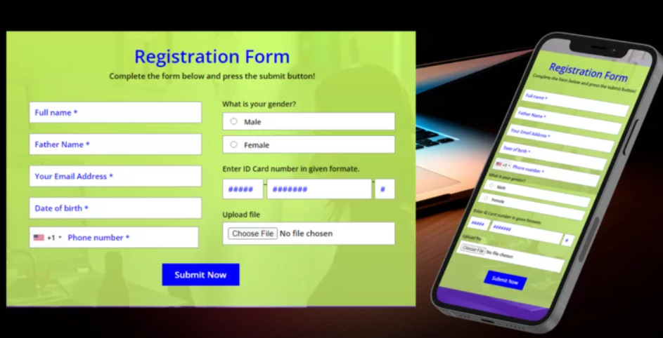
 A comparison of a desktop versus mobile form is shown.
Basic Form Structure
Let's start with the basic structure of an HTML form. Here we have a simple form with text fields and a submit button.
html
Basic Form Styling
Let's apply some basic styling to make the form visually appealing.
css
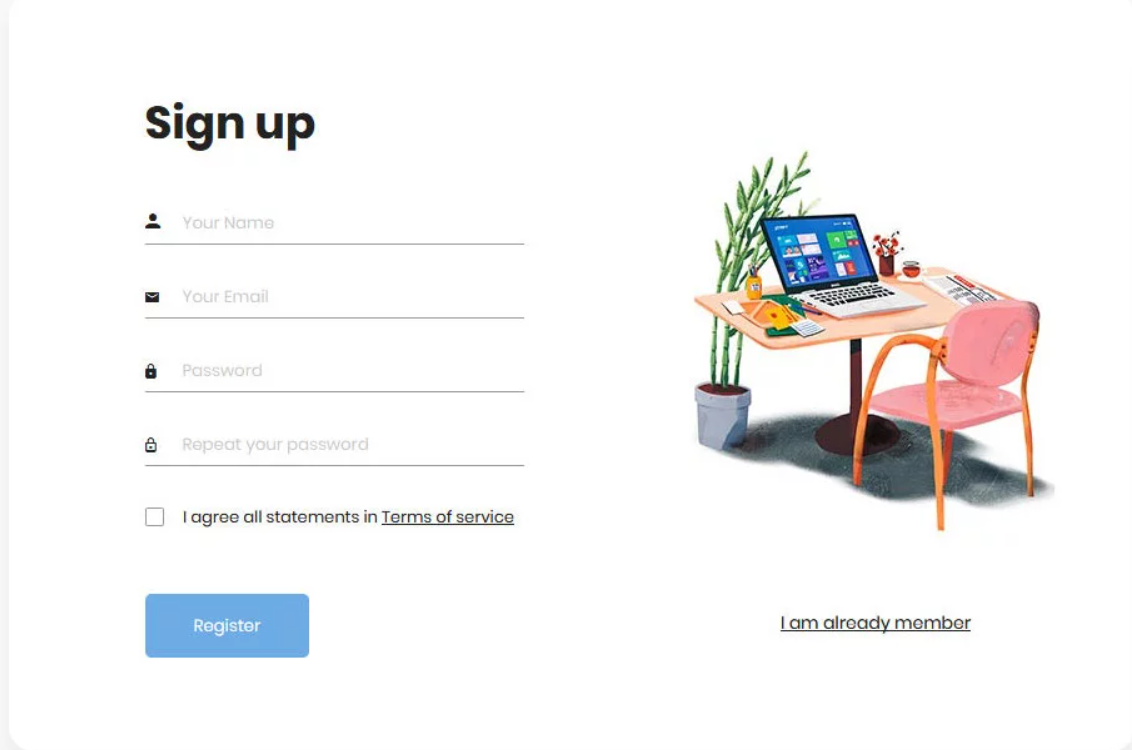
 A stylized form is shown on a desktop device.
Optimization for Small Screens
To make the form easier to use on small screens, we will use media queries to adjust its design. We can increase the size of fields and buttons and ensure the form occupies the full width of the screen.
Mobile Media Query
css
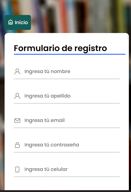
 This image shows a form adjusted for small screens
Accessible Form Fields
Ensuring forms are accessible to all users is crucial. Here are some techniques to improve form accessibility:
Clear Labels
Each input field should have a clear label (<label>) that describes its purpose. Labels should be associated with the field using the for attribute, which matches the input field's id.
html
Touch Element Size
On mobile devices, it's important that interactive elements, like buttons and input fields, are large enough for users to tap easily. Google recommends a minimum touch target size of 48px by 48px.
css
Mobile-Specific Inputs
Using specific input types like tel, email, and number enhances the user experience on mobile devices by displaying the appropriate keyboard for the input type.
html
Accessible Submit Buttons
The submit button should be clearly visible and accessible, and it should be sufficiently separated from other elements to avoid accidental clicks.
css
Form Validation
Form validation helps ensure users enter correct data. CSS can easily show validation messages to inform users when they've entered something incorrectly.
css
Conclusion
In this chapter, we have learned to design responsive forms that are easy to use on mobile devices. We also saw how to make forms accessible, ensuring elements are large enough to tap and fields have clear labels.
Support Chuck’s Academy!
Enjoying this course? I put a lot of effort into making programming education free and accessible. If you found this helpful, consider buying me a coffee to support future lessons. Every contribution helps keep this academy running! ☕🚀

Chat with Chuck

- Introduction to CSS
- CSS Selectors
- The Box Model in CSS
- Colors and Backgrounds in CSS
- Typography in CSS
- Design Techniques with CSS
- Responsive Design Fundamentals in CSS
- Responsive Navigation in CSS
- Responsive Forms in CSS
- Combinando CSS con HTML para un diseño completo
- CSS Debugging and Optimization
- Working with CSS Libraries and Frameworks
- Customizing CSS Frameworks
- Structuring Large CSS Projects
- Best Practices for CSS Performance
- Keeping CSS Code Clean and Well-Documented
- Testing and Debugging CSS
- Ensuring Accessibility with CSS
- Use animations and transitions in an accessible manner
- CSS Optimization for Large Websites
- Keeping Clean and Scalable CSS Code


