Basic CSS
Responsive Design Fundamentals in CSS
Responsive web design is a modern approach that ensures web pages look and function well across a wide variety of devices and screen sizes, from mobile phones to desktop monitors. In this chapter, you'll learn the basic concepts and CSS techniques for creating websites that adapt to different screen resolutions.
What is Responsive Design?
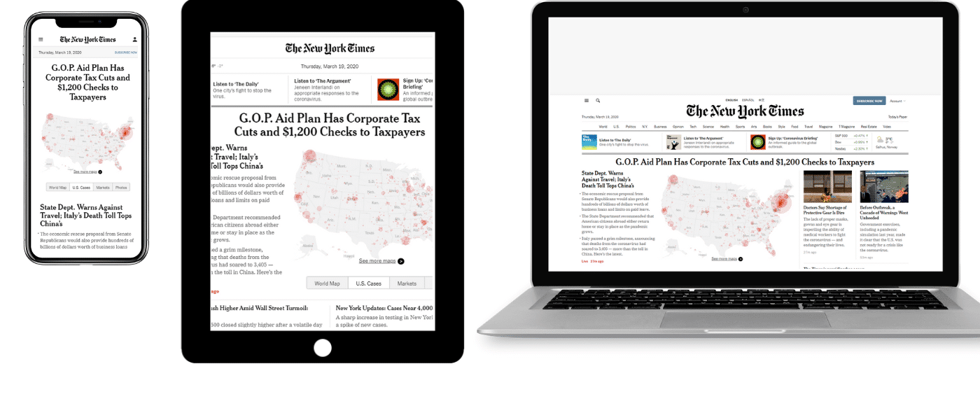
Responsive design is based on the idea of creating a single web page that can dynamically adapt to different screen sizes without content overflowing or looking bad. This improves accessibility and user experience, regardless of the device being used.
 This image shows a visual comparison of a web page on a mobile device, a tablet, and a desktop screen, showing how content adapts
Using Flexible Units
To achieve a responsive design, we must avoid using fixed units like pixels, and opt for flexible units that adjust to different screen sizes.
Relative Units
Relative units like percentages (%), em, rem, and vw/vh allow creating a design that scales proportionally to the device's screen.
-
Percentages (
%): Used to define widths and margins relative to the size of the parent container.css"In this example, the width of the div will be 50 percent of its parent container's size, allowing the size to adjust on different screens." -
Em and Rem: Used to set text sizes, margins, and paddings based on the font size of the container (
em) or the root element (rem).css"Here we use rem so that the font size of the paragraph is 1.2 times the root font size, allowing the text to scale proportionally." -
Viewport width and height (
vwandvh): These units are based on the browser window size.1vwis equal to 1% of the window's width, and1vhis equal to 1% of the window's height.css"With this rule, the height of the section will occupy 100 percent of the visible browser window height."
Viewport Meta Tag
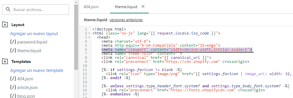
To ensure a web page is fully responsive, it's important to include the following meta tag in the HTML file. This tells the browser how to scale and display the page on mobile devices.
html
 This image shows a screenshot of HTML source code with the viewport meta tag highlighted.
Media Queries
Media queries allow applying different CSS styles based on device features, like screen width. They are the key tool for achieving responsive design.
Basic Media Query Example
Media queries allow defining different CSS rules based on screen width. Below is an example where the background color changes depending on the screen size.
css
Common Breakpoints
A breakpoint is the point at which the design changes to better fit a new resolution. Here are some common breakpoints used in media queries:
- 320px: Small phone screen size.
- 768px: Tablet screen size.
- 1024px: Desktop screen.
- 1440px and up: Large or high-resolution screens.
css
Mobile-first Design
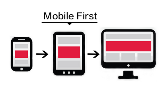
The mobile-first approach means designing first for mobile devices and then adding additional styles for larger devices. This approach is ideal because mobile phones are now the most common devices for browsing the internet.
css
 This shows a visual example of how mobile-first design changes on mobile and desktop devices
Responsive Images
Images also need to be responsive to adjust to different screen widths. This can be achieved using CSS properties like max-width or HTML elements like <picture> and srcset to load different images based on screen resolution.
Example with CSS
css
Example with HTML and srcset
html
Conclusion
In this chapter, we have learned the fundamentals of responsive design, including the use of flexible units, the viewport meta tag, media queries, and creating responsive images. These techniques will help you create web pages that look good on any device. In the next chapter, we'll explore how to improve navigation on responsive sites, which is essential for usability on mobile devices.
Support Chuck’s Academy!
Enjoying this course? I put a lot of effort into making programming education free and accessible. If you found this helpful, consider buying me a coffee to support future lessons. Every contribution helps keep this academy running! ☕🚀

Chat with Chuck

- Introduction to CSS
- CSS Selectors
- The Box Model in CSS
- Colors and Backgrounds in CSS
- Typography in CSS
- Design Techniques with CSS
- Responsive Design Fundamentals in CSS
- Responsive Navigation in CSS
- Responsive Forms in CSS
- Combinando CSS con HTML para un diseño completo
- CSS Debugging and Optimization
- Working with CSS Libraries and Frameworks
- Customizing CSS Frameworks
- Structuring Large CSS Projects
- Best Practices for CSS Performance
- Keeping CSS Code Clean and Well-Documented
- Testing and Debugging CSS
- Ensuring Accessibility with CSS
- Use animations and transitions in an accessible manner
- CSS Optimization for Large Websites
- Keeping Clean and Scalable CSS Code


